Markouts: Brokerpilot approach
Part 1. What is a Markout and Why Does a Broker Need It?
The Concept in Simple Terms
Imagine this: a client buys EURUSD from you at 1.10000. Just 100 milliseconds (a tenth of a second) later, the market price becomes 1.10005. The client hasn't closed the position yet; maybe they will hold it for a week. But one fact has already occurred: you sold them an asset at 1.10000 that was worth 1.10005 a split second later. You sold the product 5 points cheaper than its actual value a moment later.
This difference is called a markout: it measures how far the market moved in the client's favor after a specific amount of time following the trade.
A single instance like this is just market noise and luck. The market fluctuates in both directions. However, if a specific client consistently sees the market move in their favor trade after trade, it is no longer luck. The client is either faster than you (they see the fresh price while you still have the old one) or they know something about the market direction that you don't.
This type of order flow is called toxic. It costs the broker money on every execution, regardless of whether the client ultimately closes the trade in profit or loss.
What a Markout is NOT
This is the most crucial part of the document. Markouts are often confused with standard Profit/Loss (PnL), leading to incorrect conclusions.
A Markout is NOT:
- The client's profit or loss: The client could close their position at a loss, but still have a positive markout. This happens if they entered at a great price but held onto the trade too long. Markout only analyzes the first 60 seconds after entry.
- The actual money the broker lost: It is merely an evaluation of the execution price quality. The actual financial result depends on whether you hedged the position and how the client exited.
- The result of a closed trade: Closing a position is not involved in the calculation at all. Even if the client closes the trade in 3 seconds, the markout will still be measured at the 60-second horizon.
The proper analogy: Markout is a thermometer for the quality of the prices you provide. It doesn't count the money in the cash register; it simply shows where you have a "fever".
Why Measure It?
The traditional way to find a problematic client is to wait until they make a significant profit and then investigate after the fact, which takes weeks. Markout finds the exact same toxic pattern in minutes. If a client systematically "guesses" the immediate next second, it becomes obvious after just a few dozen trades. The Markouts screen automates this: it highlights which symbols and which clients generate toxic flow, and suggests what type of flow it is.
Part 2. How is Markout Calculated?
The Formula
For a single trade at a specific moment after entry:
Markout = Direction × (Price_after_Time_T - Deal_Price).
- Direction:
+1if the client bought (Buy), and-1if they sold (Sell). - Deal_Price: The actual execution price from the trading platform.
- Price_after_Time_T: The market price a specific time (T) after the trade. This uses the middle of the spread:
(bid + ask) / 2.
The Sign: Remember This Rule
Positive (+) = The market went in the client's favor = Bad for the broker. The multiplication by "Direction" is done exactly for this reason: for both Buy and Sell trades, a positive number means the same thing—the client was right.
- Client Bought: Price went up = Markout is positive (bad for broker). Price went down = Markout is negative (good for broker).
- Client Sold: Price went up = Markout is negative (good for broker). Price went down = Markout is positive (bad for broker).
Everywhere on the screen, the word Adverse means a positive markout (unfavorable for the broker).
An Example with Numbers
A client buys 1 lot of EURUSD (100,000 Euros) at 1.10000.
| Time Passed | Price (Mid) | Markout in Price Points | In Dollars |
|---|---|---|---|
| 100 ms | 1.10005 | +0.00005 | +$5 |
| 1 s | 1.10008 | +0.00008 | +$8 |
| 60 s | 1.10002 | +0.00002 | +$2 |
Converting to dollars: Price movement × volume in base units (0.00005 × 100,000 = $5).
Notice the shape: +$5 after 100ms, but only +$2 remains by 60 seconds. The client's advantage "evaporated". What this means is explained in the Decay chart section (Part 4).
Seven Horizons
Every trade is measured not once, but seven times, at fixed moments after entry: 100 ms · 200 ms · 300 ms · 500 ms · 1 s · 5 s · 60 s.
Why seven? Because the shape is more important than the absolute value. Two clients might have the exact same markout at 100ms, but:
- Client A's advantage disappears by the 60th second. They are simply faster than your quotes (a speed issue—you need to speed up your price feed or add execution delay).
- Client B's advantage only grows by the 60th second. They are guessing the market direction (an information issue—a question for your risk policy regarding this client).
The countermeasures are completely different, and a single number cannot distinguish between them.
Part 3. Top Panel: Filters

| Filter | What it does | If left empty |
|---|---|---|
| Trade servers | Keeps data only for selected servers. | Shows all servers. |
| Symbols | Keeps only selected symbols by exact instrument name (e.g., XAUUSDb and XAUUSD are different). | Shows all symbols. |
| Metric | Changes the number displayed in the heatmap cells. It does not recalculate data or change cell colors. | Defaults to Total USD. |
Important to know:
- Data is only calculated for MT4 and MT5 servers. Other platform servers might appear in the filter, but there will be no data for them.
- The
Symbolsfilter affects the heatmap, the decay chart, and theAdverse $column. However, it does NOT affect theClasscolumn (client classification is always calculated across all their symbols).
Part 4. Heatmap and Decay Chart
4.1. Heatmap Rows: Symbols and Groups
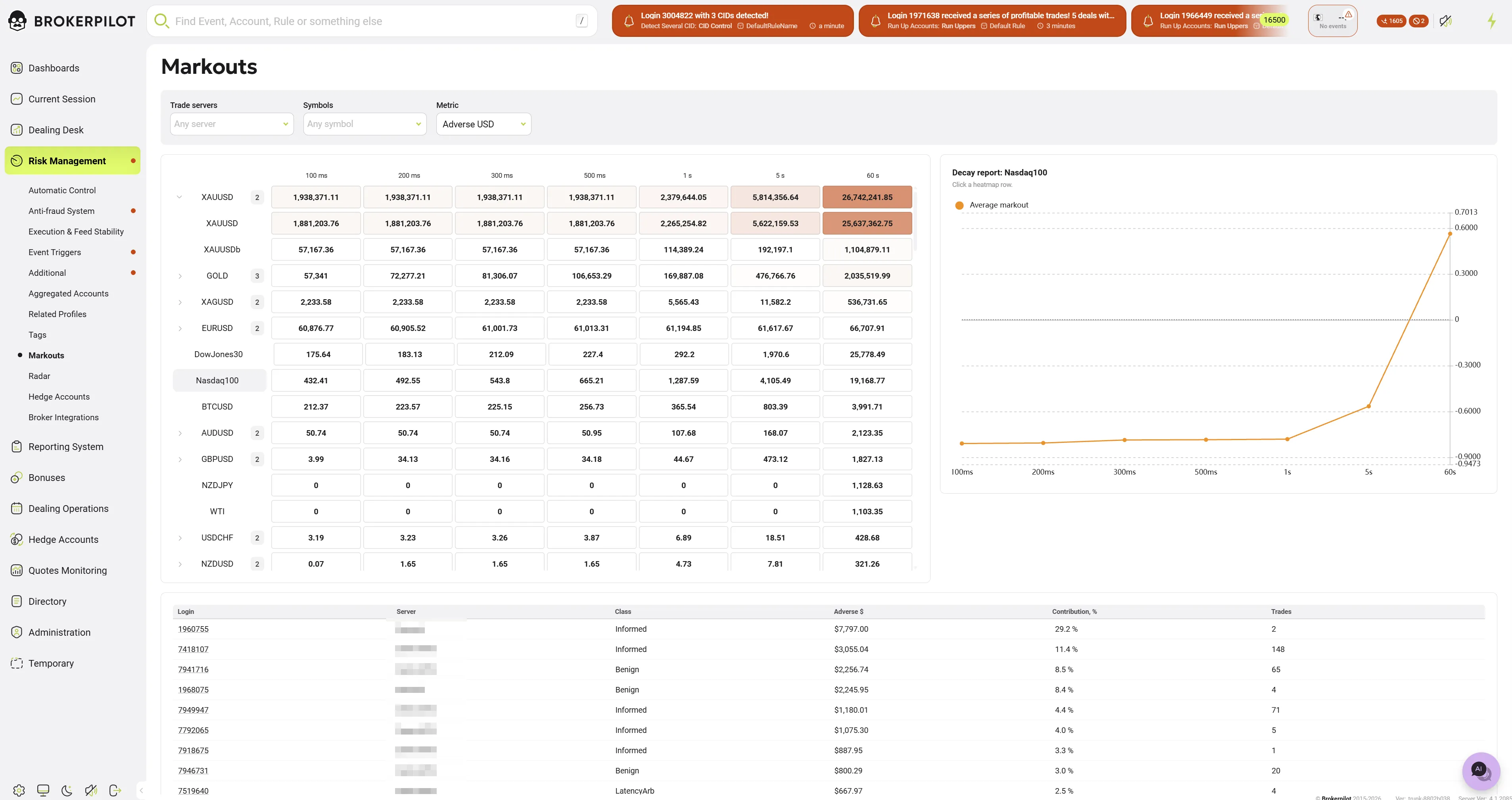
Each row is a trading instrument. Some rows have an expand arrow and a small badge with a number on the left.
- What it is: An aggregation group. It represents the same real-world instrument traded under different names across servers. For example, gold might be "XAUUSD" on one server and "XAUUSDb" on another. The system groups them into one "XAUUSD" row. A badge with "2" means "there are two different instrument names inside" (not two servers!).
- Why it's useful: To see the total picture for gold instead of hunting down every suffix. Expand the row to see each name's individual contribution. Clicking on a row selects the symbol and draws its Decay chart on the right.
4.2. Heatmap Columns: Horizons
The seven columns are the seven measurement horizons: 100ms, 200ms, 300ms, 500ms, 1s, 5s, 60s. Each cell is the sum of all trades for that symbol over the last 24 hours, measured at that specific time horizon. An empty cell means no data for that horizon.
4.3. Metric Switcher: What the Numbers Mean
| Metric | What it shows | How it is calculated | When to use it |
|---|---|---|---|
| Total USD | The net result in dollars (broker wins and losses combined). | Sum of markout in USD for all trades on this horizon. Negative = broker is in profit. | "How much does client entry cost us in total on this symbol?". |
| Adverse USD | Only the "bad" half: client winnings. | Same as Total USD, but every trade where markout is 0 or less is counted as zero. | "How much toxic flow is here?" (Even if the symbol is profitable overall). |
| USD per million | Toxicity per unit of volume. | Total USD / Volume * 1,000,000 (Volume in base units: 1 lot EURUSD = 100,000). | To fairly compare symbols with vastly different trading volumes. |
Why Adverse USD "unfairly" ignores the good half and why that's correct:
Imagine a symbol where you make $100,000 on regular clients and lose $95,000 to two arbitrageurs. Total USD will show -$5,000 (a profit for the broker), completely hiding the problem. Adverse USD will show $95,000, making the arbitrageurs visible. Total USD answers "how much does it cost?", while Adverse USD answers "is there a disease inside?".
USD per million is necessary because a large Total USD might just mean massive volume. A million dollars adverse on a major currency pair with giant volume is just background noise; the same numbers on a thinly traded exotic pair is a catastrophe.
4.4. Cell Color: Why a Red Cell Can Have a Negative Number
This is the most common question, so let's clarify.
The color does NOT depend on the number in the cell or the selected metric. The intensity of the red always represents the same thing:
Redness = (Adverse USD of this cell) / (Adverse USD of the entire table).
The color answers the question: "What portion of all the toxic flow on this screen is concentrated right here?". It is a continuous scale without thresholds; there is no green color.
Example: A cell shows -$8,024,264 (Total USD) but is painted deep red. Is this a contradiction? No. The cell is telling two truths at once:
- In total, this symbol on this horizon brought the broker $8 million (Total USD is negative).
- Hidden inside this very cell is one of the largest concentrations of client winnings on the entire table (hence the red color). It is an overall profitable symbol with a toxic core hidden inside. Follow the color to find the problem; read the number to assess the scale.
4.5. Decay Chart: What it is and How to Read it
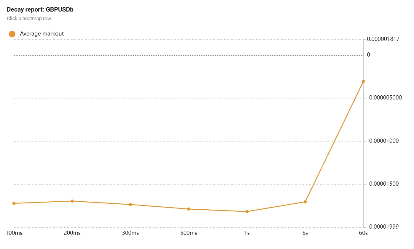
- What it is: "Decay" means fading away. The chart shows the average markout of the selected symbol across all seven horizons: seven dots connected by a line. The X-axis is time (100ms to 60s), and the Y-axis is the average markout.
- Units: It is measured in price points of the symbol itself, NOT in dollars. For EURUSD, 0.00005 is half a pip; for gold, 0.30 is thirty cents per ounce.
- Because of this, you cannot compare the height of two different symbols' charts.
- The chart is always built for a single symbol specifically for this reason.
How to read it: Look at the shape of the line, not the height. Remember: above zero = in client's favor = bad for the broker.
Three Typical Patterns:
- Healthy Flow (Noise): The line hovers around zero across all horizons. Clients, on average, are not guessing correctly. This is normal client flow.
- Fast Flow (Latency Arbitrage): A sharp spike at 100-500ms, and by 60 seconds the line drops back to zero. Someone consistently wins the first fraction of a second, but their advantage melts away. The client sees a fresh price faster than you do and hits your outdated price. Solution: speed up your price feed or adjust execution settings.
- Informed Flow: The line steadily grows from 100ms to 60s. The advantage doesn't fade; the market continues to move in their direction. The client actually knows the market direction. Technical fixes won't work here; this is a risk-policy issue.
Note on Average Markout: The dot is a simple average of all trades (Sum of markout / number of trades), without factoring in volume. One huge trade won't outweigh 100 small ones. Decay shows the typical behavior of the flow, while other columns show the money.
Part 5. Accounts Table (Bottom of Screen)
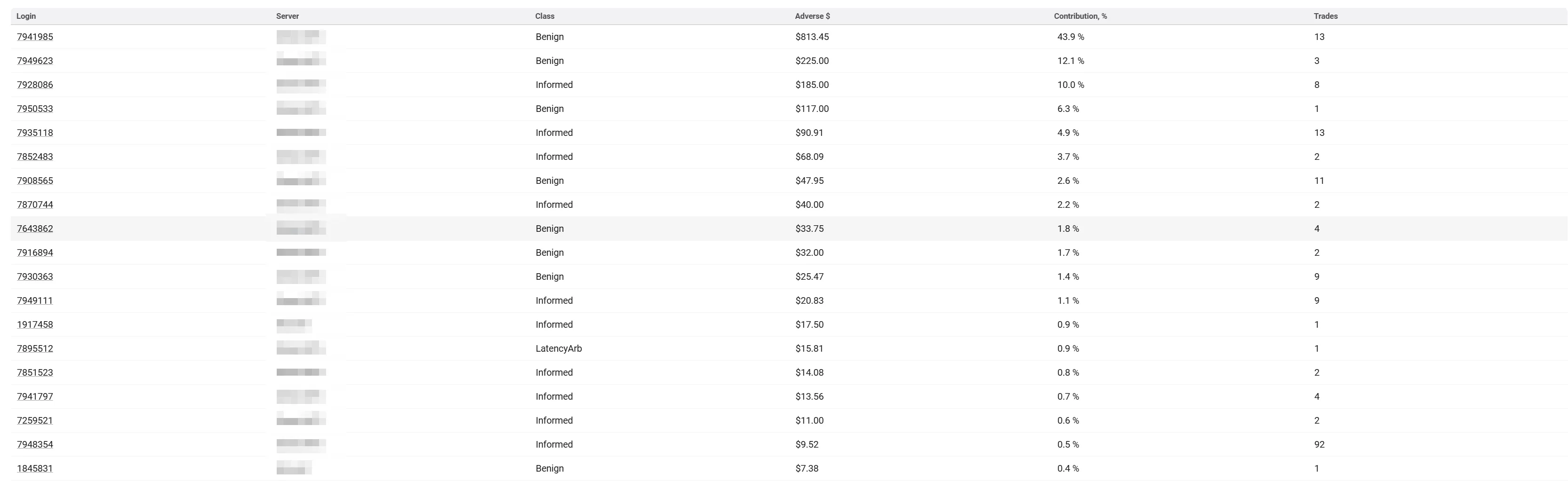
This section shifts focus from symbols to people: who exactly is generating the toxic flow. Clients are sorted descending by the Adverse $ column over the last 24 hours. A client with the same login number on two different servers is treated as two separate rows.
- Login: The client's trading account number. Clicking the number opens the account card; clicking anywhere else on the row opens the Client Markouts panel.
- Server: The trading server where the account is active. Shows exactly where the problem is concentrated.
- Class: Automatic classification of the client based on the shape of their decay curve (analyzing all their symbols combined over 24 hours).
- Unknown: No data, or couldn't be normalized (Not the same as harmless).
- Benign: Curve never goes above zero (Normal client).
- Informed: Sustained advantage over time (Client guesses market direction).
- LatencyArb: Spike before 500ms that fades away (Latency arbitrage behavior).
- Caveats: LatencyArb is a conclusion based on price behavior, not a measured client ping. Also, a client with just 1 trade gets a label just like a client with 10,000 trades. Always check the
Tradescolumn.
- Adverse $: Total adverse markout in dollars over the last 24 hours. Only positive markouts (broker losses) are summed. Negative markouts (broker wins) are treated as zero, meaning broker wins do NOT offset client advantages here. This metric is a toxicity rating, not a real financial PnL, so do not quote it to clients or put it in accounting.
- Contribution, %: The percentage of the total
Adverse $created by this specific client. If a client is at 62.6%, resolving their account fixes two-thirds of your problem. (Note: Denominator is all clients under the filter, so visible rows won't necessarily sum to 100%). - Trades: Number of market opening trades calculated. Closures, deposits, or pending order activations are not counted.
Part 6. Client Panel (Opened by clicking a table row)
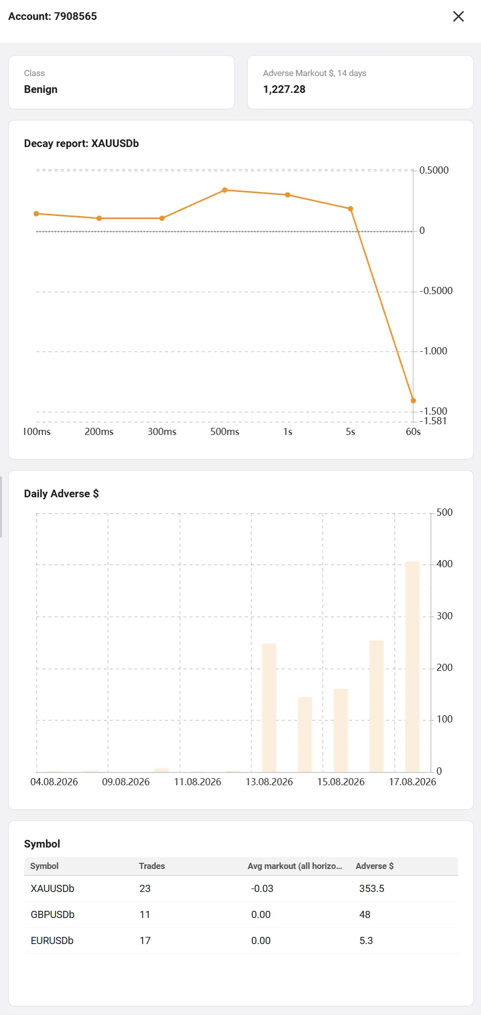
This is the dossier on a single client.
- Class tile: The same classification as the main table, calculated across all the client's symbols for 24 hours.
- Adverse Markout $, 14 days tile: This tile and the Daily chart below it are the only places on the screen that use a 14-day window. The number here will be much larger than the Adverse $ in the main table (which is 24 hours).
- Decay report: Same logic as the main decay chart, but built ONLY for this client's trades, and ONLY for their single most problematic symbol (listed in the title). It is perfectly normal for a client to be classified as "Informed" overall, while this specific single-symbol chart looks harmless.
- Daily Adverse $ chart: The 14-day Adverse $ broken down by calendar days. Even bars indicate systemic behavior (algorithms), while one huge spike indicates an isolated event (news, price spike).
- Symbol table (Bottom): Breakdown of the client's activity by instrument over 24 hours. Compares
Avg markout(how accurate they are in price points) withAdverse $(how painful it is in dollars due to volume).
Part 7. Time Windows: 24 Hours vs 14 Days
One rule explains all "mismatched" numbers on the screen: Everything on the screen is calculated for a rolling 24-hour window, EXCEPT two elements on the client panel: the "Adverse Markout $, 14 days" tile and the "Daily Adverse $" chart, which use a 14-day window.
If two numbers don't match, check if they belong to the same time window.
Part 8. What is Excluded (System Boundaries)
- Platforms: Only MT4 and MT5 are supported.
- Closures: Closing a trade does not stop the measurement. Horizons always count from the entry time up to 60 seconds, even if closed early.
Part 9. Workflow Cheat Sheet
- Heatmap: Look for the reddest cells-that's the concentration of toxicity. Use
Total USDto see if it's expensive, andUSD per millionto compare different symbols fairly. - Decay Chart (Click a symbol): Check the curve shape. Spike + fade = speed issue. Steady growth = informed trader.
- Accounts Table: Use
Contribution %to see if one client is the main problem. CheckClassfor the type, andTradesto see if the data is reliable. - Client Panel: Use the
Dailychart to spot systemic behavior vs. single events, and theSymboltable to see what they are trading. Do not compare the "14 days" tile with the 24-hour tables.
Appendix A: Quick Glossary
- Markout: How far the market moved in the client's favor after their trade. Positive = bad for broker.
- Horizon: The measurement moments (100ms to 60s).
- Adverse: Unfavorable for the broker (a positive markout).
- Adverse $: Sum of only positive markouts in dollars (Toxicity rating, not actual loss).
- Decay: The curve showing average markout over time.
- Mid: Middle of the spread
(bid + ask) / 2. - Base units: Volume calculation (
lots * contract size). - Class: Automatic categorization (Unknown / Benign / Informed / LatencyArb).
Appendix B: Formula Summary
- Raw Markout:
Direction * (Price_at_horizon - Deal_price)(in price points). - Adverse USD:
Sum(max(markout_usd, 0)). - USD per million:
Total USD / volume * 1,000,000. - Cell Color:
Adverse of cell / Adverse of whole table. - Average Markout (Decay):
Sum of raw markouts / number of trades. - Contribution %:
Client Adverse / Total Filtered Adverse * 100.